Super Cars Online
When it comes to incredibly fast road cars there at least fifteen manufacturers that immediately sprint to mind (well, if you’re me anyway). All of those manufacturers have websites, because it would be very, very weird not to in 2020, and all of them feature glossy pictures of the lovely cars. But are the websites any good? There’s a lot of scope for building a less-then-optimal website these days, and even the best known companies can fall flat, so I’ve decided to have a look.
Comparing all of them would make this post a bit too much of an epic undertaking so for now I’ve limited this post to just five - Lamborgini, Ferrari, McLaren, Aston Martin and Koenigsegg. There’s no good reason why I settled on those 5 in particular apart from the fact they’re all relatively well known, they all make fantastic cars, and (maybe) they all have similar budgets for their online offerings.
The websites under test are;
- https://www.lamborghini.com/en-en
- https://www.ferrari.com/en-GB
- https://cars.mclaren.com/gb-en
- https://www.astonmartin.com/en-gb
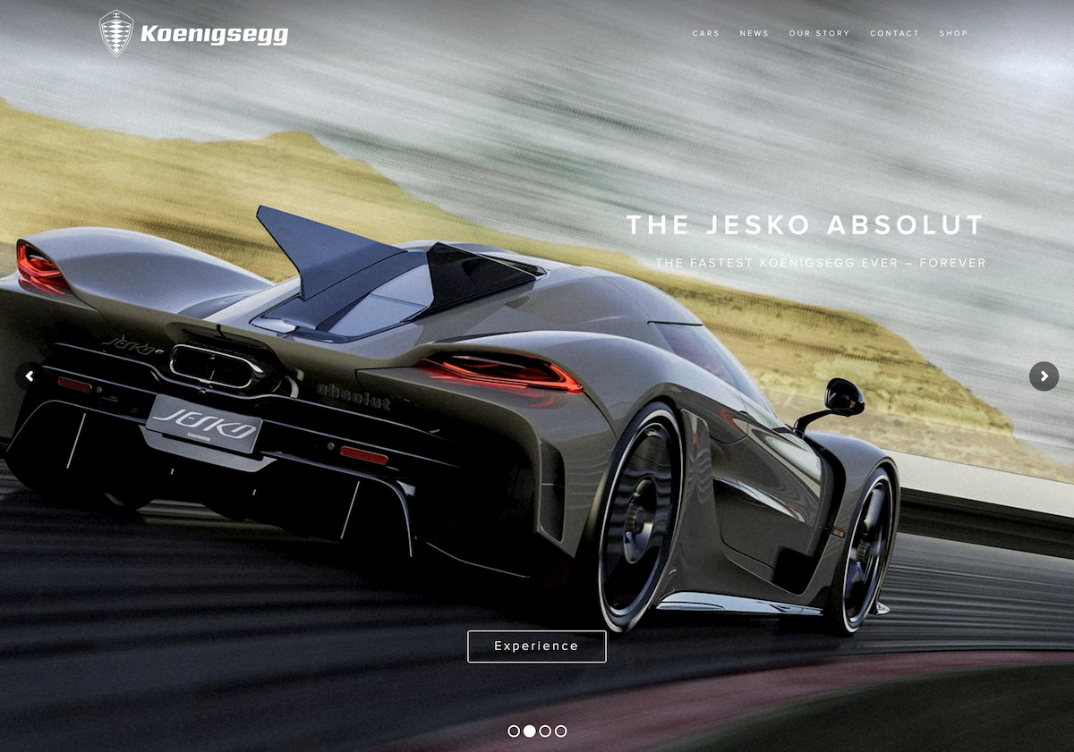
- https://www.koenigsegg.com/
The methodology to pick the URLs is simple. Each one is the first Google result from a search of the manufacturer’s name, with the exception of McLaren. McLaren is actually a racing team first and foremost, so for that one it was necessary to follow a link to the cars subdomain.
Each of the sites tested was tested using the same approach. There’s a Lighthouse and an AxE accessibility check, a check of the page weight with a cold cache and a warm cache, and a bit of poking about under surface in devtools.
There are a few interesting things to note immediately even before loading the sites - four out of the five URLs redirect the user to a country code (or language code) path on their first load. I suspect the path is determined using the the browser’s ‘Accept-Language’ header, but using a domain path means the user share the link, and clicks will go to the page the user saw rather being redirected based on the language header again. It’s a simple thing but I like it for websites that get a lot of visitors from different countries.
The good bits
As you might expect from some leading car companies that sell luxury products, these are some lovely looking websites. There’s good quality images, good visual flow throughout, and everything is easy to navigate around. There are some questionable choices (hamburger menus on desktop sites? Why?) but overall the sites all definitely get the job done.
There isn’t much in the way of fancy web stuff. There’s certainly no three.js or SVG shenanigans happening here. I’m putting that under ‘good bits’ because, as much as fancy web effects are fun, unless they’re done well they just make your CPU fan have a stroke and hammer the scrolling. So, here at least, the lack of web tech actually works in the sites’ favour.
Modern design with interesting touches
Each and every one of the websites is very ‘on-trend’ with the way websites are presented today. There are lots of little CSS animations making things fly in from the sides, lots of full-bleed images, and each site uses transitions to give the user an impression of motion.
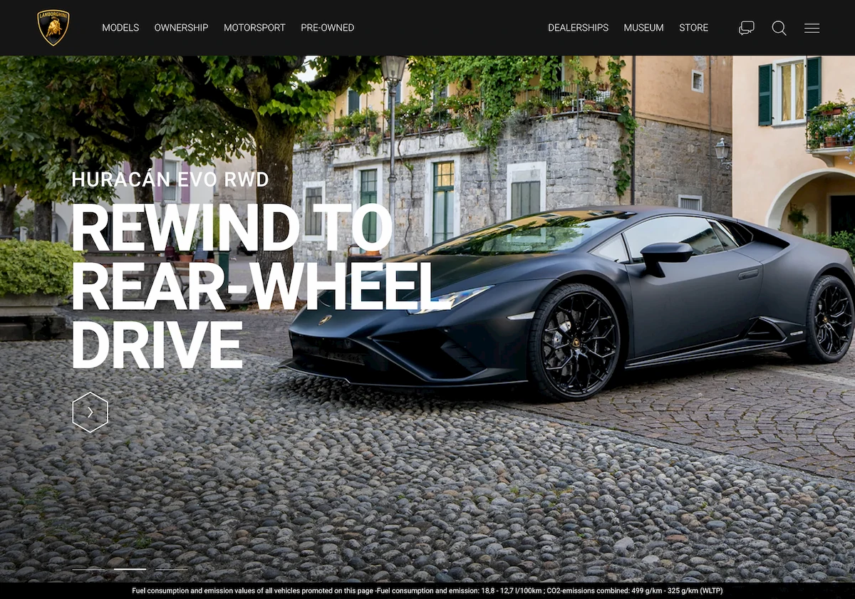
Lamborgini’s website features a great image slider for the configurator that shows three images offset from one another using a transform: skew(-20deg) with a transform-origin: bottom left that’s a beautifully effective way of making the slider items a bit more interesting. It’s not something I’ve seen done before.
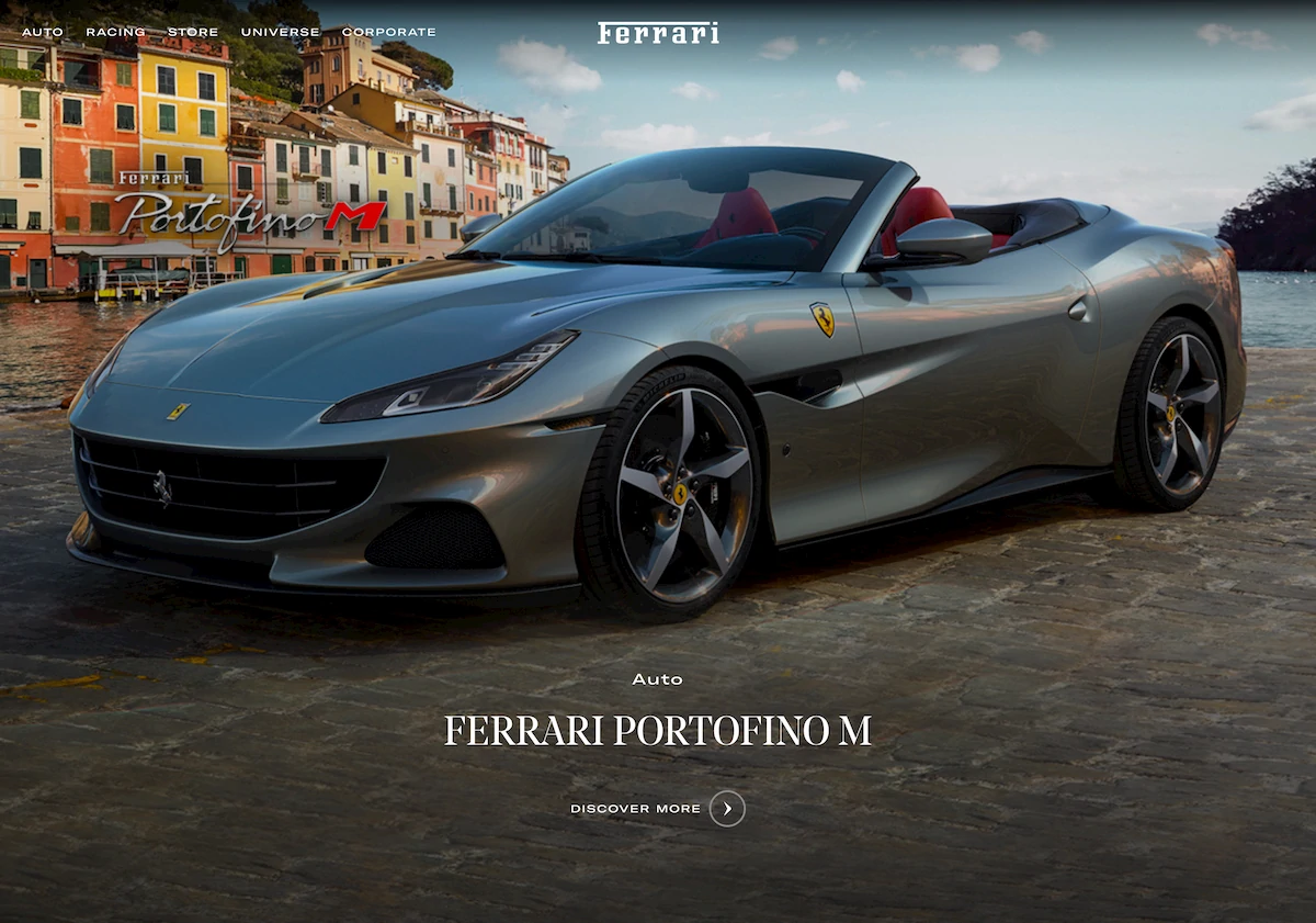
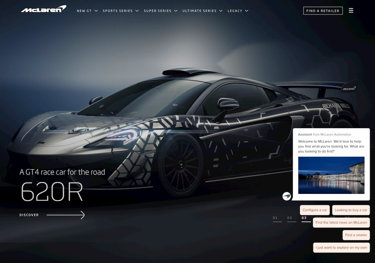
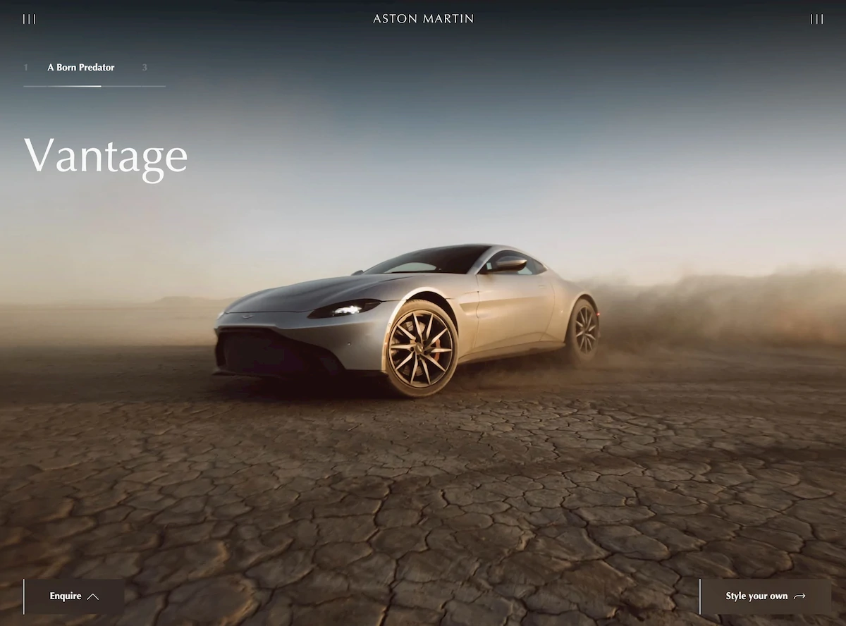
Ferrari, McLaren and Aston Martin all feature below-the-fold full-screen video elements on their websites. This is a good way of getting video content in to a site while avoiding the in-your-face aspect of it being the first thing the users encounter.
At the bottom of the Koenigsegg (I have to cut and paste that name every time…) site there’s a well integrated Instagram gallery that uses filter: greyscale(1) to turn the images grey, and removes the filter on hover. That’s a nice effect.
Shiny images lazy loaded
Two of the car manufacturers have embraced the modern web to a small extent by deploying new image formats to their sites. Aston Martin and Lamborgini both deliver the main images in WebP format. Slightly oddly in the case of Lamborgini, the file name ends in .jpg but the image is a WebP. I suspect some sort of image CDN is transforming things on the fly there.
The other manufacturers use JPG and PNG for the bulk of their images. Fortunately all of the websites use lazy loading, which means the initial page load isn’t terrible for image assets but they could do so much better. Squoosh all the things.
The not so good bits
While the websites look good and do a few interesting things, there isn’t much to differentiate between these five websites (see the screenshots in the sidebar - I didn’t accidently put the same one in five times despite it looking that way). Each site opens with an above-the-fold-full-screen-hero-image of a car. Scroll down and each of them have the same split view sections about the product range. They all close the page with a news section and a footer stuffed with links. Honestly, if you swapped the car images between the different sites no one would be able to tell. It’s quite boring. Maybe the people who buy these cars like boring websites. I don’t though.
Hefty bois
These websites are big in terms of page weight. Ferrari’s site weighes in at a chunky 5MB and that’s the smallest of the five. The initial load for Aston Martin’s site pulls down a frankly massive 33MB of content. Again, these are luxury brands using rich media to sell pricy cars, but still. That’s not exactly trim for a website.
Ignoring the image and video assets, there’s a lot of room for optimization. Each site includes several fonts for regular, bold and italic text that could be replaced with a single variable font. The fonts that are there include data that isn’t used in the website content - for example, in the case of Koenigsegg’s koenigseggsans there are 227 glyphs in total. That’s just sending the user a lot of unnecessary symbols.
All of the websites serve lots of separate CSS files and chunked JS that isn’t defered. This is a lost opportunity to drop some time on the first paint metric. The page won’t render anything until it has the necessary CSS files, so including several at once will almost always just drive the time the user has to wait up. Fortuntely all of the sites bar Koenigsegg are using HTTP 2.0 to serve their CSS assets so they’ll at least be fetched in parallel. Koenigsegg, sadly, is still on the older HTTP 1.1, so browsers will only fetch a maximum of 6 files at a time.
Track days
| Site | Ad Trackers | 3rd Party Cookies | Key logging | Facebook | Google Analytics |
|---|---|---|---|---|---|
| Lamborgini | 4 | ✓ | ✓ | ||
| Ferrari | 12 | 13 | ✓ | ✓ | ✓ |
| McLaren | 9 | 4 | ✓ | ✓ | |
| Aston Martin | 8 | 11 | ✓ | ✓ | ✓ |
| Koenigsegg | 1 |
Running each of the sites through Blacklight is quite illuminating.
First up, a hearty congratulations to Koenigsegg for only gathering statistics in a single service with no third parties or keylogging or Facebook. I suspect that Blacklight is reporting no Google Analytics incorrectly here because the ad tracking service it finds is actually Alphabet Inc, which is effectively Google. But still, one tracker is better than all the other sites.
The number of third party cookies isn’t all that surprising given the rich media each of these sites use. There’s a lot of content delivery networks involved here, for optimizing images and streaming video. It’s still bad, but it is understandable. Maybe these car manufacturers could swap to privacy-aware CDN providers instead.
The ‘Key logging’ found on Ferrari and Aston Martin comes from services like Hotjar that track exactly how a user interacts with a website. They can follow the user’s mouse pointer or keyboard presses and provide detailed information of the precise journey a user takes through a website, where they pause and read, where they move the mouse to and don’t click, and so on. The intelligence provided is undoubtedly useful for optimizing a website, but at the same time it’s creepy as hell and, in my opinion, worthwhile installing a blocker to stop the tracking service getting that information.
Build quality
If these websites were actual cars there’d be some issues with the panel mounting. Each of them have small but definitely fixable issues with the code, ranging from the relatively minor like Lamborgini’s website using a document.write in the code somewhere, to the potentially more drastic problem on McLaren’s website where jQuery is used without being downloaded. Even the sites where all the scripts work have issues. Ferrari gets a 404 on a JS file, Koenigsegg fails to fetch Font Awesome, and Aston Martin has a console warning from the video player script that the video has been paused. That’s trivial in itself but it betrays the fact that the build process isn’t stripping console messages, which in turn shows that something in the deployment pipeline isn’t ideally optimized. There’s no point pushing console messages in to production where (unless the viewer is a nosy dev like me) they’re going to go unseen.
These might sounds like I’m going looking for petty issues that don’t matter to most users, and to an extent that’s exactly what I am doing, but they do matter to me. Websites should be high quality peices of software that work well. Errors shouldn’t make it to production, and if they do they should be fixed. The errors on these car manufacturer’s websites have been there for weeks (I know because it takes me a long time to write a blog post…)
Conclusions
Having looked at these websites for a few weeks researching this post I’ve come to the conclusion that they’re not my cup of tea. Initially I was impressed, but spending time with the sites has make me realise I’m impressed by the cars themselves, and the pictures of the cars (I mean, the cars are amazing), but not the websites. They’re boring. They don’t present the user with anything more exciting than some pretty pictures.
From the layout to the tech to the art direction it’s all quite staid. I’d bet my life that the teams who built these websites were following that precise brief - they were tasked with making a website that’s in the luxury brand classy-and-chic-but-in-no-way-challenging mould. I don’t hate them because there’s nothing to hate. They’re just nice, and that’s a pity.
The numbers
| Site | Performance | Accessibility | Best Practices | SEO | Total |
|---|---|---|---|---|---|
| https://www.lamborghini.com/en-en | 37 | 72 | 71 | 79 | 259 |
| https://www.ferrari.com/en-GB | 11 | 91 | 79 | 83 | 264 |
| https://cars.mclaren.com/gb-en | 27 | 78 | 71 | 88 | 264 |
| https://www.astonmartin.com/en-gb | 68 | 97 | 71 | 85 | 321 |
| https://www.koenigsegg.com/ | 37 | 71 | 79 | 83 | 270 |